The Entrepreneur Life

Tag: design

Delighting customers – how one packaging team did it for me!

TL;DR We bought an Anker SoundCore 2 Bluetooth wireless speaker and many of the small, yet thoughtful and nice design touches by the Anker packaging team delighted me. Hence this blog post.

Over the summer our younger daughter’s constant use of a Bluetooth speaker made it evident to my wife and I all that we were missing. Earlier attempts at using a Bluetooth speaker were marred by a cheap freebie we received when signing up for a membership. So this time we were determined to get one for ourselves, so we didn’t have to sneakily borrow our daughters while she slept in late.

Of course the Indian parent in me had sticker shock when I set out to buy a 10W Bluetooth wireless speaker. Fortunately the earlier bad experience ensure that I did not go in for the cheapest one but nor did I want to splurge multi-hundred dollars on one that also did a seemingly variety of things (of course despite 9-years of college, I could not understand a whole lot of features the high end ones boasted of, but that’s a story for another day!) Thus we ended up with the SoundCore 2.

Once I got the speaker itself out, setting it up and getting it going was straightforward. As I decided to put away the box, I saw it still had a small blue box inside. I assumed it was for the charging cable. It was. But it also contained a little card with the single word question ❇︎ Happy? on it. And on the back it had the question ❇︎ Not happy?

As you can see in the pictures above, the direction of text on either sides of the card was flipped, intuitively reading the right side up, depending on whether you choose Happy or Not happy! Most importantly, inside the card it told you what you can do, in case you were not happy and nudged you to share if you were.

Whilst there can be any number of nitpicky things around features (pairing with more than one device) that I could potentially quibble over, I must admit as a marketer feeling happy at the thought that has gone into this packaging delighting me as a customer. A great example of how customer delight does not have to be contained only within the product. Great job, Anker packaging (product?) team.

Maintaining Privacy in Social Media – An Ongoing Battle

I had been planning to write a piece on how folks are getting off of social media particularly Facebook—from the famous such as Om Malik to a lot of 18 to 29-year olds. Even when people choose to stay on networks (social or professional) it’s hard to maintain the degree of privacy or control they seek. It’s hard for at least two reasons

  • there’s just a LOT of options, kinds of data, kinds of audiences an and
  • companies just don’t make it easy for users to turn on or off something.

This became really evident when I tried to help a LinkedIn user yesterday to maintain some contact info private. You’ve have thought that you would go to Settings & Privacy, as I did, and fix it. Well, you’d be wrong, just as I was.

While I consider myself a technophile and an experienced user of LinkedIn – neither a dekko through their settings nor a Google search produced a reliable answer on, “How do I not reveal by birthdate on LinkedIn?” The nearest I got to was this Quora post, and of course, LinkedIn had changed things around again!

The changes range from explicitly leaving out the word Birthday from the options listing, which was tucked away under Contact Info, which was hidden (and not evident at all) under the Intro section of your profile.

and how to get to even this stage. It involved

  1. Selecting View Profile from the Me menu on the top right
  2. Then choosing the Edit (pencil icon) in the Intro section
    LinkedIn-Edit-Profile
  3. Scrolling down to the contact info section (above) and choosing the Edit (pencil icon) again
    LinkedIn-Contact-Info
  4. Clicking on the eye icon to now actually select the desired settings for your birthday
    LinkIn-BDay-Options

It took me nearly 20 minutes to research, test and ensure this works before I could help the original LinkedIn user who’d sought my help. Not cool! LinkedIn you can do better than this!


Consistency in User Experience

The last two days my team and I were at an offsite at a local hotel. The meeting room, was in the basement, at the end of a long corridor, nestled in a far corner of the hotel’s Business Center. While our meeting was productive it was a stuffy two days. Made me wonder, how comfortable the US President would be in the White House bunker (at least what I’ve seen of it in movies) given its even greater depth.

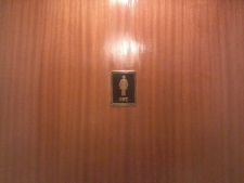
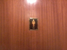
When you spend all day in a stuffy room, drinking fluids, having the rest rooms nearby helps. The first time I walked up to them I had to look closely to figure out which door led to the right room. A smart designer had decided to use two tiny androgynous figures, with the words HE and SHE written below them to designate the men’s and women’s restrooms.

She He

Not the best of experiences when you are in a hurry (and when like me you’ve walked into the wrong room, while on a phone!) Alas the story didn’t end there.

During a short break we walked up and out of the lobby to catch some fresh air. On my way back, I decided to use the restroom right behind the lobby and encountered the following two doors and signs that now read GENTS (that’s what I think it said, the fancy font made ready hard) and LADIES. Clearly the same designer was not involved in the design of these two (ornate) doors. Luckily I was wearing my glasses and headed into the right room without any mishap.

ladies gents

It could have been worse I suppose, with signs in German (HERREN and DAMEN) or symbols for male (♂) and female (♀) or playing cards (KINGS and QUEENS). At least for our toilets, why can’t we make things simple with LARGE pictures (for the language or visually challenged) and words for the graphically challenged. This is a solved problem.

I wish I could attribute this to one or more zealous or incompetent interior designers. However, starting from even the most common and widespread of software products (can you say Microsoft Word), we encounter such design inconsistencies every day. All of us, whether involved in building software products, ticketing portals or hotels or mobile phones, need to provide our users consistent, predictable and self-evident user experience aka good design.

I have a hard enough time figuring things out, when I’m not in a hurry to go! So please let’s pay attention to our poor users and help them have a more consistent and intuitive experience.

Good design is in the details

Cover of "The Design of Everyday Things"

A couple of weeks ago, I wrote about the work of Donald Norman and his seminal book “The Design of Everyday Things” (the title itself was in true design fashion improved from the original “The Psychology of Everyday Things” or POET.)  I was also bemoaning that people seem to be far more familiar with Jonathan Ive, the much heralded (and recently knighted) designer of many things Apple, than with Don Norman and his now business partner Jakob Nielsen, who’ve been evangelizing human-centered design longer than most.

Of course reading The Design of Everyday Things has once again made me sensitive to good and bad design decisions that surround us and I wanted to share a couple of instances of poor design (or poor affordances, as Don terms them). Just the other day I swung by an ATM machine, tucked in next to a Food World store. And here’s what the greeted me at the door.

Push or Pull A sign that said PUSH but a handle that said pull. This is one of the first examples Don cites for cognitive dissonance – a fancy term for when what the sign says (push) doesn’t gel with what your brain says you should do (pull). Alas Don wrote his book more than 20 years ago and we are still grappling with this one.

Another favorite one of his is figuring out which switch (on a bank of switches) controls what light or electrical equipment in a room. Just this last weekend we sneaked away to Yercaud (an largely unspoilt hill station near Salem, Tamil Nadu). The hotel we stayed in was relatively new and the first thing that greeted me, as I tried to turn on the lights was this bank of switches.

The housekeeping staff, had to put a small sticker with a sign that read Fan. Given that there are only five switches, sure we can run through them quickly – however you’d have an irate spouse in the middle of the light if you turned a light on rather than the fan 🙁 In this particular bank of switches, you can see the set up is a pair of switches (neither of which controls the fan) and the regulator in one block while three other switches in another block (one of which controls the fan). Ideally pairing the regulator and the switch into a single standalone block would have worked or having them at the very least on the same block would have provided a clear affordance.

The good news is that good design shows up in most unexpected places. The office provided me with a Tata Photon 3G broadband USB dongle. Most of us who’ve used any sort of USB dongles, whether memory sticks, Bluetooth, WiFi or broadband, have experienced the bother of losing the caps that come with them. Invariably once I’m done using the stick and remove it from the computer, I am constantly searching for the cap and usually end up just doing without it. The Tata Photon previous generation dongles suffered from this same short coming as I saw with my colleagues. However the latest dongle that I was provided, had a most ingenious solution – a wrist band that was strung through the cap – so not only was carrying the darn thing easier, but the cap even when removed stayed attached (and conveniently) out of the way, so that when it was time to stow away the stick, I don’t have to begin searching for the cap. Good design, like god is in the details.

Enhanced by Zemanta

Design for Dummies, Mummies & Others

“How do I get the word count on this document? In the past when I selected a paragraph, I’d get a count of the words in it, right here at the bottom left.” A colleague was struggling to get Microsoft Word to do what she wanted.

Design of Every Day Things

Photo credit: livemint.com

The next time you take a short trip on an aeroplane, take a look around yourself. It’s almost certain that anyone who’s travelling for business and working on a laptop is using a spreadsheet or working on a presentation in PowerPoint or Keynote. With these tools playing such an integral part of our everyday lives, you’d think they’d be easy to use. Yet people, including the colleague I wrote of earlier, have to call on their co-workers, spouses and nephews of neighbours to get some specific function done, often one they’d used before. If this were a matter of software alone or particularly inept computer users, we’d likely be able to deal with it a whole lot easily. But, alas, this lack of usability or user-friendliness is not confined to software or even computers alone.

The Design of Everyday Things
Even the simplest of office equipment, starting with the copier, overhead projector or network printer (poor you, if it includes a scanner) require instructions to operate, as evidenced by hand-scribbled notes and printed instructions from other users, stuck on and around them. When all that fails, we then rely on the admin expert to make these do what we’d like them to. Before you figure that I’m an inept luddite, these usability problems are by no means unique to electronic equipment.

From the faucets in airport toilets to the glass doors in our office, you can see fellow travellers struggling to operate them, often requiring multiple attempts before getting water to flow (lift, press or twist) or doors to open (push, pull or slide).
In a world that deified Steve Jobs even when he was alive and the name of Jonathan Ive is known to more folks than you’d think is possible, why is good design so hard to come by? Before we try to answer that question, let’s do an experiment.

Try this at work today. Get four of your colleagues, hand them a piece of paper and ask them to make aeroplanes. After 10 minutes of flying those aeroplanes, give them a blank piece of paper and ask them to write a six- or eight-step process to make paper aeroplanes without illustrations. Now hand these instructions to other colleagues or use them yourself to see if you can make an aeroplane at all, let alone one that flies. Now why is it that folks, even ones that have multiple college degrees, who almost without thought can make pretty darn good paper planes, can’t write a set of easy-to-follow instructions on how to build such a plane?

In his book The Design of Everyday Things, cognitive psychologist Donald A Norman answers these and a whole lot of other questions about why design—particularly user-friendly design—is not easy. Norman, whom Newsweek called “The Guru of Workable Technology”, begins with how people interact with everyday things. The three critical elements to using things successfully are, in his words, visibility, appropriate clues and feedback of one’s actions. So whether a hot and cold water faucet or the turn signals in your car, if they are visible so you can locate them easily (in front of you rather than by your foot), provide visible clues or affordances (lift, press or turn) and provide feedback (flowing water, blinking direction indicator) upon being operated, we have the makings of usable design.
Norman also provides numerous examples of good and excellent user-centred design, whether in felt pens or floppy drives, and explains why many of them never get a chance to go through the five or six attempts required to get a design right.
Businesses and each of us individuals will find our lives more productive and a whole lot less stressful if we understand the psychology of everyday things. So, the next time you see a handwritten instruction sign resolve to evangelizing user-centred design.

This article originally appeared in the Book Beginnings column in Mint in Dec 2011

© 2024 K Srikrishna

Theme by Anders NorenUp ↑